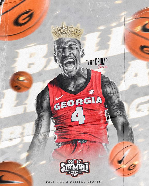
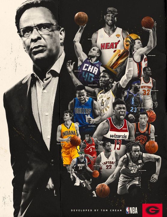
2024 to Now
Assistant Athletic Director, Creative Strategy
University of Georgia
Leads creative strategy and brand execution across every sport, platform and content discipline at Georgia.
21 staff across 5 creative departments
From designing championship identities to leading creative across an entire athletic department, I’ve spent 13+ years building brands, developing teams, and shaping how fans experience college sports. My approach combines a designer’s attention to detail with a leader’s understanding of the people, strategy, and structure behind great creative work.
See the workI’ve spent my career at the intersection of creative work, brand building, and leadership in college athletics. What started as a graphic design role has grown into leading creative strategy for one of the most recognizable brands in college sports. Along the way, I’ve built creative departments from the ground up, developed visual identities that have become part of championship history, and led teams responsible for how millions of fans experience a brand every day. I believe great creative work comes from a combination of strong ideas, talented people, and the right structure to bring it all together.
Where leadership and craft meet.
Building cohesive brand identities and the creative systems that support them. Establishing standards, tools, and processes that bring consistency across teams, platforms, and audiences without sacrificing individuality.
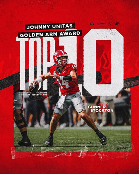
Turning ideas into compelling creative work through a clear vision, strong visual storytelling, and thoughtful execution. Guiding projects from initial concept to final product across digital, print, social, and physical environments.

Building and leading multidisciplinary creative teams with an emphasis on collaboration, accountability, and professional growth. Creating an environment where talented people have the direction, resources, and trust to do their best work.
Building the structure behind great creative work. Developing workflows, establishing priorities, and improving how teams collaborate to deliver high-quality content consistently, even under demanding production schedules.
Working alongside senior leadership to turn organizational goals into clear creative priorities. Connecting big-picture strategy with day-to-day execution while balancing brand integrity, resources, and the needs of multiple stakeholders.
Creating visual identities built to be recognizable, meaningful, and lasting. From individual marks to complete identity systems, developing designs that reflect a brand's history, personality, and purpose across every application.
Designing custom typefaces and typography systems that give brands a distinct visual voice. Combining traditional design principles with practical applications across apparel, digital platforms, signage, and physical spaces.
A foundation in hands-on design, from typography and composition to illustration and photo manipulation. Bringing strong visual fundamentals and attention to detail to everything from individual graphics to large-scale campaigns.
Developing content strategies that connect brands with their audiences. Combining long-term storytelling, platform-specific creative, and real-time content to create consistent, engaging experiences across digital channels.
Leading creative development and production across video, photography, and original programming. Bringing teams and disciplines together to tell compelling stories through a consistent creative vision across short-form, long-form, and emerging platforms.
Brand systems, typography and championship identities for Georgia Athletics. Select a project to open its case study.
 Athleticsbrand manual. — Georgia Athletics Brand Manual2026 · Case study ↗
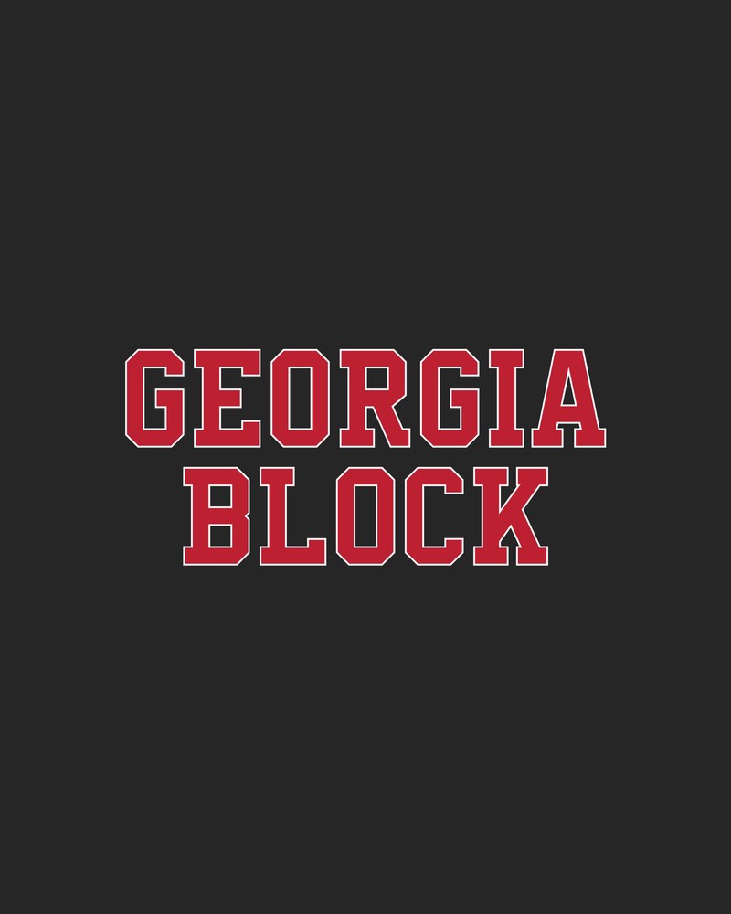
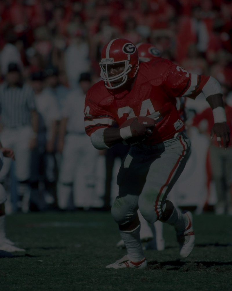 Georgia blocktype system. — Georgia Block Type System2024-26 · Case study ↗
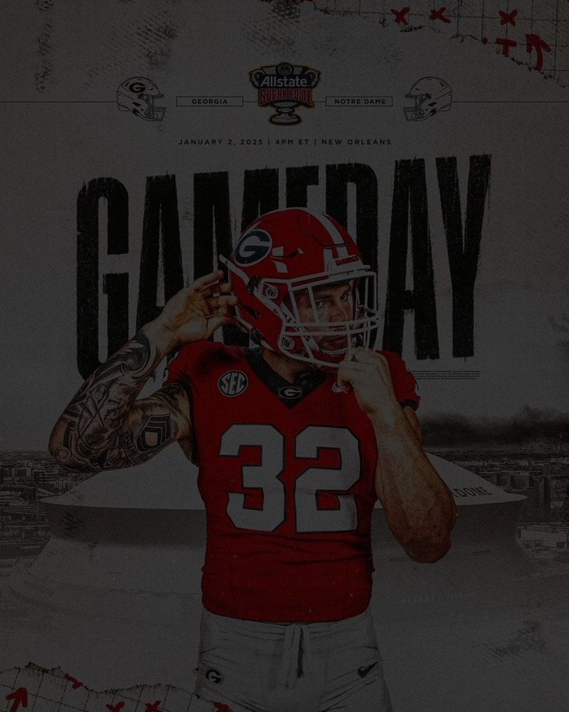 Athleticsbrand refresh. — Georgia Athletics Brand Refresh2024-26 · Case study ↗
 Originalcontent. — Georgia Athletics Original ContentVideo · Case study ↗
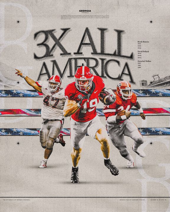
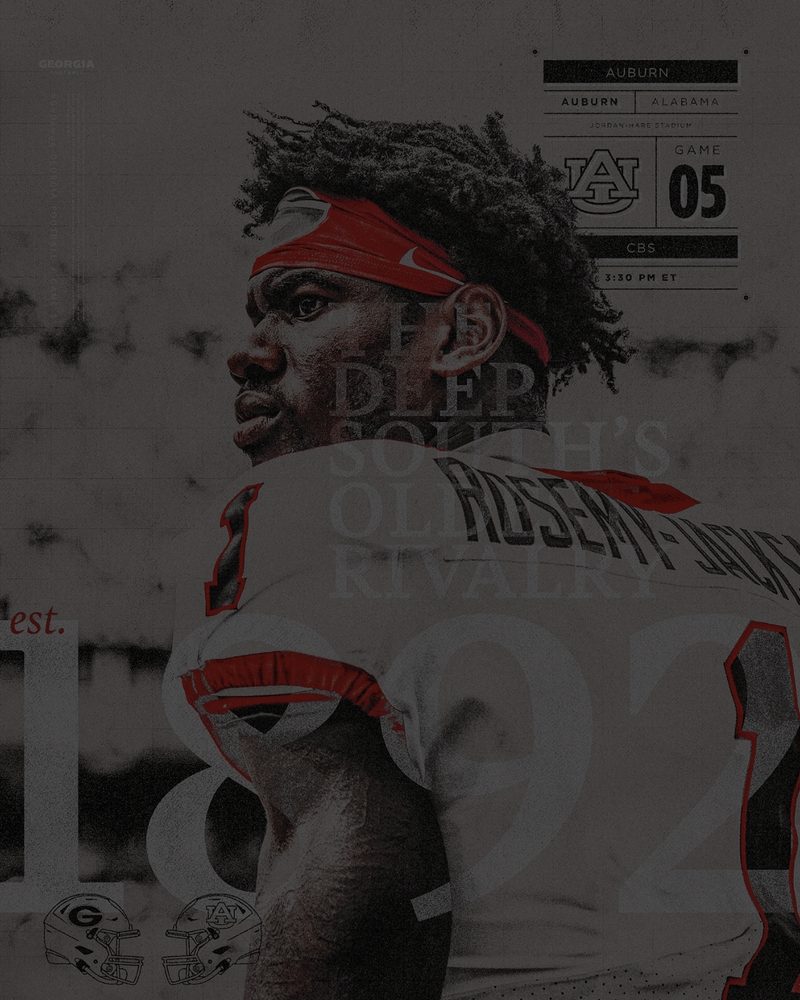 Football seasonbranding. — Georgia Football Season Branding2023–24 · Case study ↗
 National championlogo breakdowns. — National Champion Logo Breakdowns1942–2022 · Case study ↗
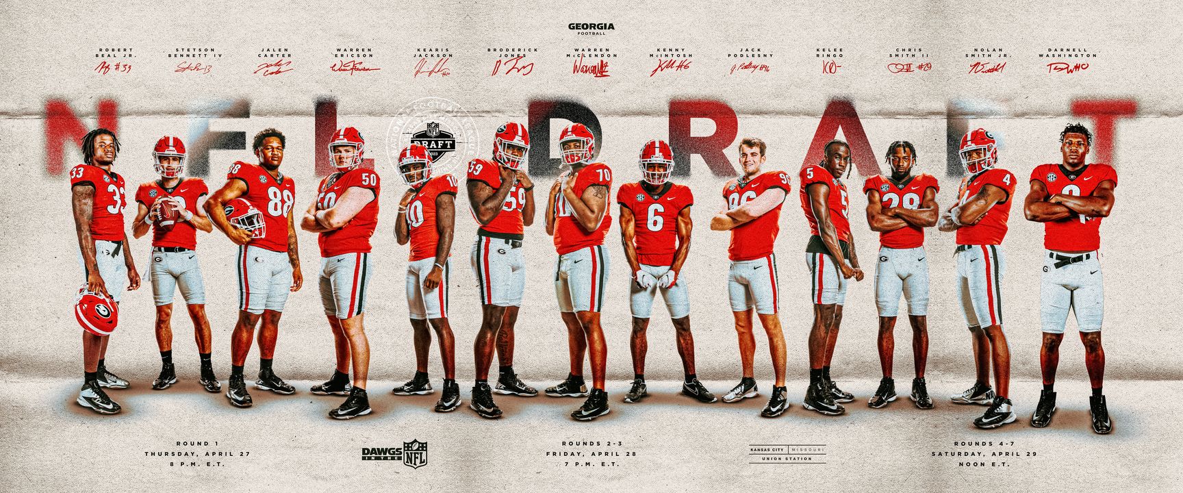
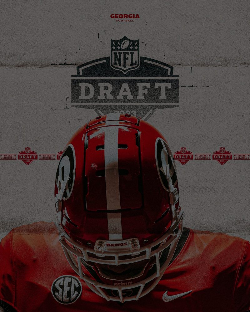 Dawgs in the NFL2023 draft. — Georgia NFL Draft2023 · Case study ↗
 Football post seasonidentity. — Georgia Football Post Season Identity2022 · Case study ↗
Thirteen years across four athletic departments, including two roles as the first creative hire.
2024 to Now
University of Georgia
Leads creative strategy and brand execution across every sport, platform and content discipline at Georgia.
21 staff across 5 creative departments
2020 to 2024
Georgia Football
Directed the full season-long content system, from preseason through bowl games, across back-to-back national championships.
1M+ followers on Football's X and Instagram
2019 to 2020
Georgia Men's Basketball
First creative director hired internally for Georgia Men's Basketball, building the function from the ground up.
1st internal creative director hire
2018 to 2019
University of Florida
Led a four-person team, directed creative for Florida's 2019 NFL Draft class and supported the 2018 College World Series run.
4 person creative team
2017 to 2018
University of Wyoming
First creative hire in department history, establishing creative direction across every varsity sport.
17 Division I sports
2013 to 2017
Mercer University Football
Began as a design assistant, helped establish the program's first consistent social content approach, and advanced to lead football creative and recruiting.
3 years on staff, design assistant to director
Case study · 2024–26
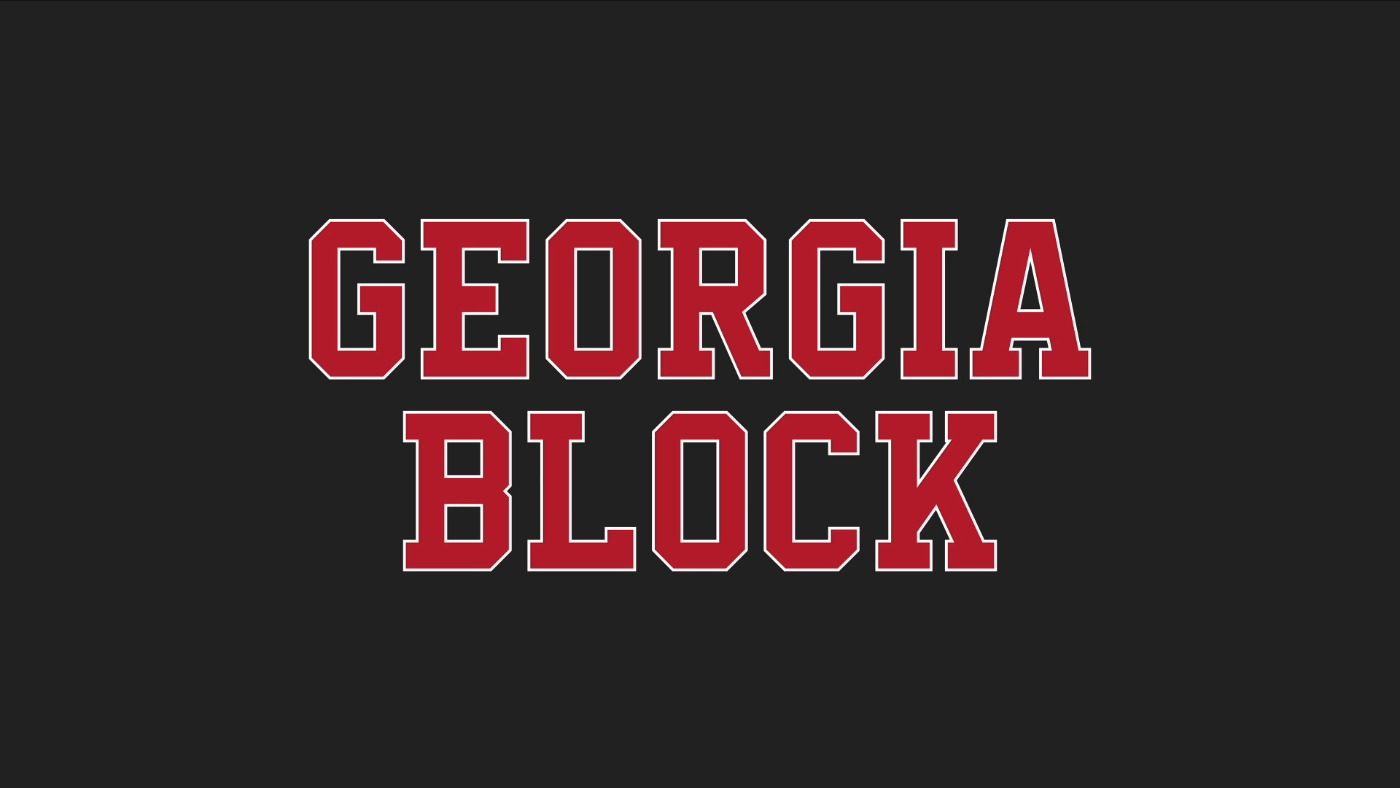
I designed the Georgia Block family to give form to Josh Brooks’ vision for a stronger, more cohesive Georgia Athletics brand: one that feels unmistakably connected to the history, tradition, and standard of the University of Georgia. The goal was to create a type system that could live everywhere, from uniforms and facility graphics to recruiting, social, signage, and merchandise, while still feeling rooted in the block-letter language that has defined Georgia across generations. Georgia Block became a way to connect the past to the present with purpose, turning a familiar visual tradition into a formal system that every sport and department could build from.
Bulldog Bold marked an important turning point for Georgia Athletics, giving the department a consistent Nike-era type system and proving the value of a unified visual identity across every sport. That foundation made this next step possible. As Georgia shifts back toward a more traditional identity, the goal is not to reject what came before, but to build on it with a typeface that feels more directly connected to the history seen across Georgia uniforms, venues, and championship moments. Georgia Block carries that legacy forward with a cleaner, more timeless expression of Georgia Athletics.
The Georgia Block family is a custom athletics type system built to translate Georgia’s historic block-letter tradition into a consistent, modern brand tool. The family includes Georgia Block and Georgia Block Sans, each available in Regular and Bold weights, giving the department flexibility across uniforms, facility graphics, social content, signage, and merchandise. Georgia Block carries the traditional collegiate feel with strong slab-serif details and squared proportions, while Georgia Block Sans offers a cleaner companion cut for applications that need the same structure with a more direct finish. Together, the family creates a unified voice that feels rooted in Georgia’s past while giving the brand a sharper, more controlled system for the future.
Across uniforms, facility graphics, social content, signage, and merchandise.
Case study · 2024–26
A department-wide brand refresh focused on creating a cleaner, more cohesive visual identity for Georgia Athletics. The project established a consistent design baseline, shared creative libraries, and sport-specific graphic systems built from the same typography, colors, textures, and production presets. The result was a more polished and unified brand presence across all 16 team accounts while still allowing each sport to maintain its own personality within the larger Georgia identity.
When I was promoted into my current role, one of the first assignments from our executive staff was to strengthen our overall brand presence. The goal from our athletic director was clear: Georgia Athletics needed a cohesive visual identity that felt strong, consistent, and distinctly Georgia across every sport and platform. My role was to take that direction and turn it into a working creative system, not simply a set of individual graphics. That meant evaluating where the brand felt fragmented, establishing clearer standards, building shared libraries, and giving our designers the structure needed to create work that felt aligned from one team to the next. The result was a more unified brand approach that gave Georgia Athletics a cleaner, more polished, and more recognizable creative voice.
The 2023-24 visual identity has a clear Georgia identity and plenty of raw creative strength, but it feels more like a collection of individual graphics rather than a fully controlled brand identity. The red, black, and white gritty textures, bold type, and athlete-forward compositions all point in the right direction, and several pieces have real energy and a competitive edge. The issue is consistency. Some graphics feel premium and intentional, while others get crowded with too many effects, too much type, or unclear hierarchy. At its best, the set feels tough, proud, and distinctly Georgia; at its weakest, it feels busy and overbuilt. Overall, the work shows strong talent and a recognizable visual foundation, but the brand would benefit from tighter rules around typography, spacing, photo treatment, and when to use restraint.
The 2023-24 set established a strong Georgia foundation: bold use of red, black, and white, gritty texture, athlete-led compositions, and a clear competitive tone. The 2024-25 set builds on that foundation, refining it into a cleaner, more polished brand system. The layouts feel more intentional, the typography is more controlled, the photo treatments are sharper, and the overall hierarchy is easier to read. There is a stronger sense of restraint in the 2024-25 work, allowing the biggest moments, athletes, and messages to command attention without unnecessary visual clutter. That added discipline makes the brand feel more premium and gives the entire department a more consistent creative standard across sports. Instead of feeling like a collection of strong individual graphics, the 2024-25 work feels like one unified department-wide visual identity: premium, aggressive, organized, and unmistakably Georgia.
Establishing a baseline was the first step in turning the brand direction into a practical system. I created a core graphic that served as the visual starting point for each designer to build from, giving every team account the same foundation before sport-specific needs were introduced. That baseline gave us control over the major brand elements: texture, color, typography, layout style, and production presets. Instead of 16 team accounts developing in separate directions, everyone was working from the same creative language. That structure allowed each sport to maintain its own identity while still feeling connected to the larger Georgia Athletics brand.
After establishing the baseline, the next step was building the libraries that would make the system repeatable. The goal was to take the same colors, type treatments, textures, logos, templates, and production presets from the initial graphic and organize them in one shared place for the entire team. That gave our designers a practical toolkit instead of a loose set of preferences. With those libraries in place, each team account could move faster, stay aligned, and produce work that felt connected across all 16 sports accounts. It also reduced guesswork, protected brand consistency, and helped turn the visual identity into something the department could use every day.
After establishing a cleaner baseline through the white graphics, my team was able to build the rest of the 2024-25 system with more purpose and consistency. The white package created the foundation: sharper hierarchy, cleaner spacing, stronger athlete focus, and a more polished editorial feel. From there, the black and red packages expanded the system without making it feel disconnected. Each color lane has its own tone, with white feeling clean and premium, black feeling intense and dramatic, and red carrying the most energy and brand weight. Together, those packages gave the department a more uniform visual structure while still allowing each sport, moment, and message to have its own personality within the Georgia brand.
The overall goal was to move Georgia Athletics from a collection of individual graphics to a true brand system. By establishing a clear baseline, building shared libraries, and giving our designers a consistent creative foundation, we created a visual identity that could scale across every team account without losing quality or personality. The result was cleaner work, stronger alignment, faster execution, and a brand presence that felt more polished from sport to sport. Most importantly, it gave Georgia Athletics a visual voice that was organized, recognizable, and distinctly Georgia.
Case study · 2026
This project centered on refining the Georgia Athletics brand manual into a clearer, more complete reference for internal teams, external partners, and licensed vendors. With the addition of Georgia Block, the manual was updated to define how the new display typeface should work alongside the existing logo system, wordmarks, color palette, secondary typography, and application standards. The final guide gives creative teams a consistent foundation while still allowing room for bold, sport-specific expression across recruiting, social, print, facility, retail, and game-day materials.
I was charged with updating the Georgia Athletics brand manual to reflect the introduction of Georgia Block, a new custom display font designed to strengthen the department’s visual identity. The update focused on integrating the typeface into the existing brand system with clear standards for usage, hierarchy, legibility, and consistency across digital, print, environmental, and recruiting applications.
Rather than treating the font as a standalone design element, the goal was to position Georgia Block as a functional extension of the athletics brand: bold, recognizable, and rooted in the tradition of Georgia Athletics while giving creative teams a sharper and more consistent typographic tool for future work.
Page through the guide below. Click a page or use the arrows to turn it, and use the magnifier on any page to read it full size.
Case study · Identity · 1942–2022
Four championships. Eight decades of history. Four distinct visual identities.
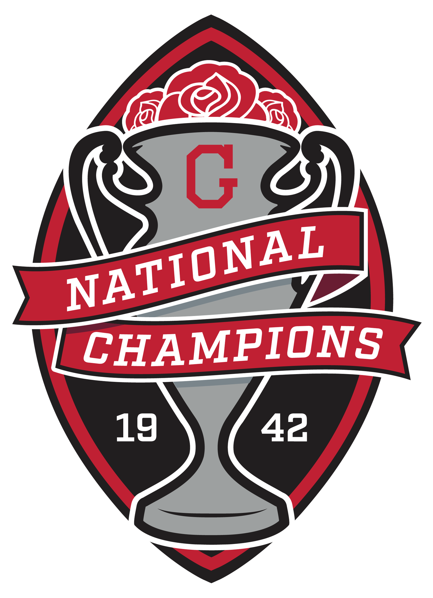
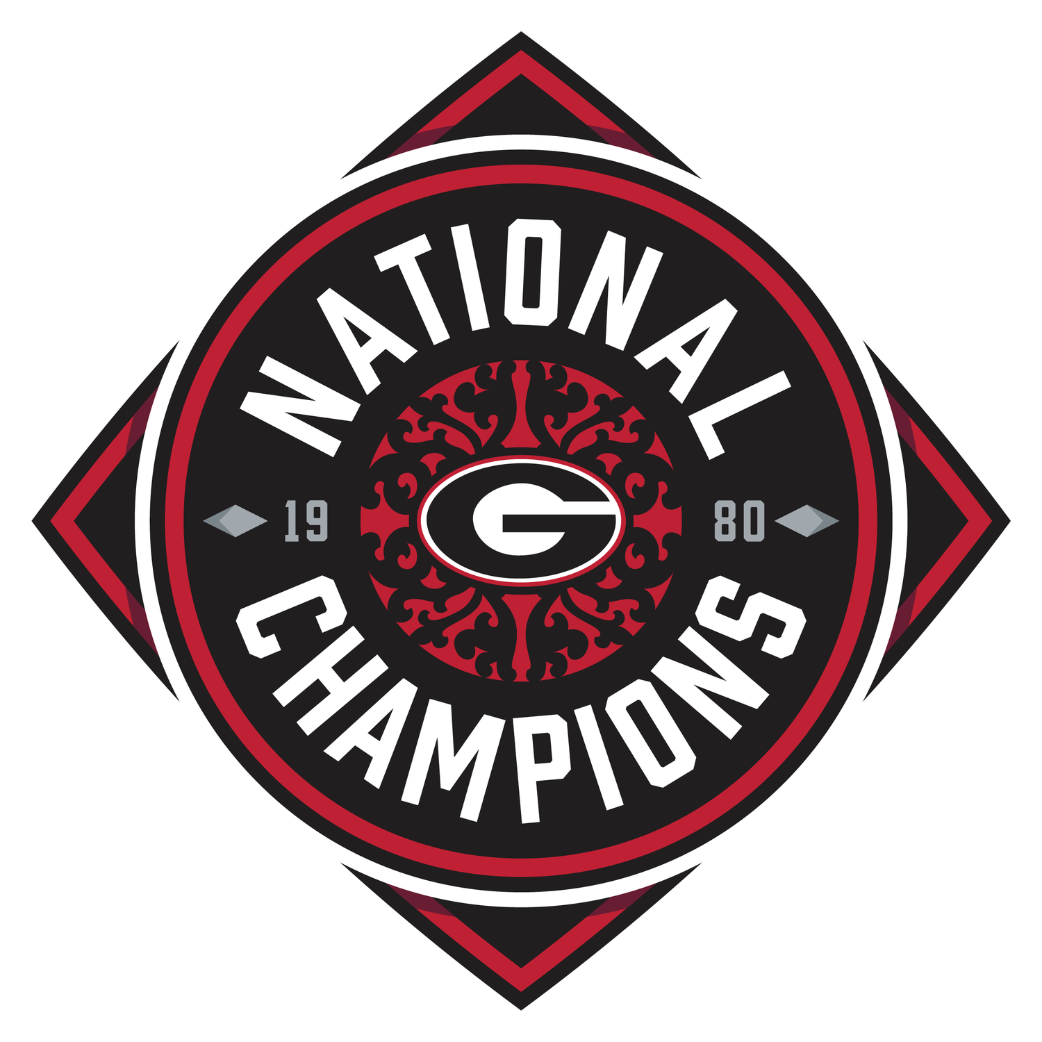
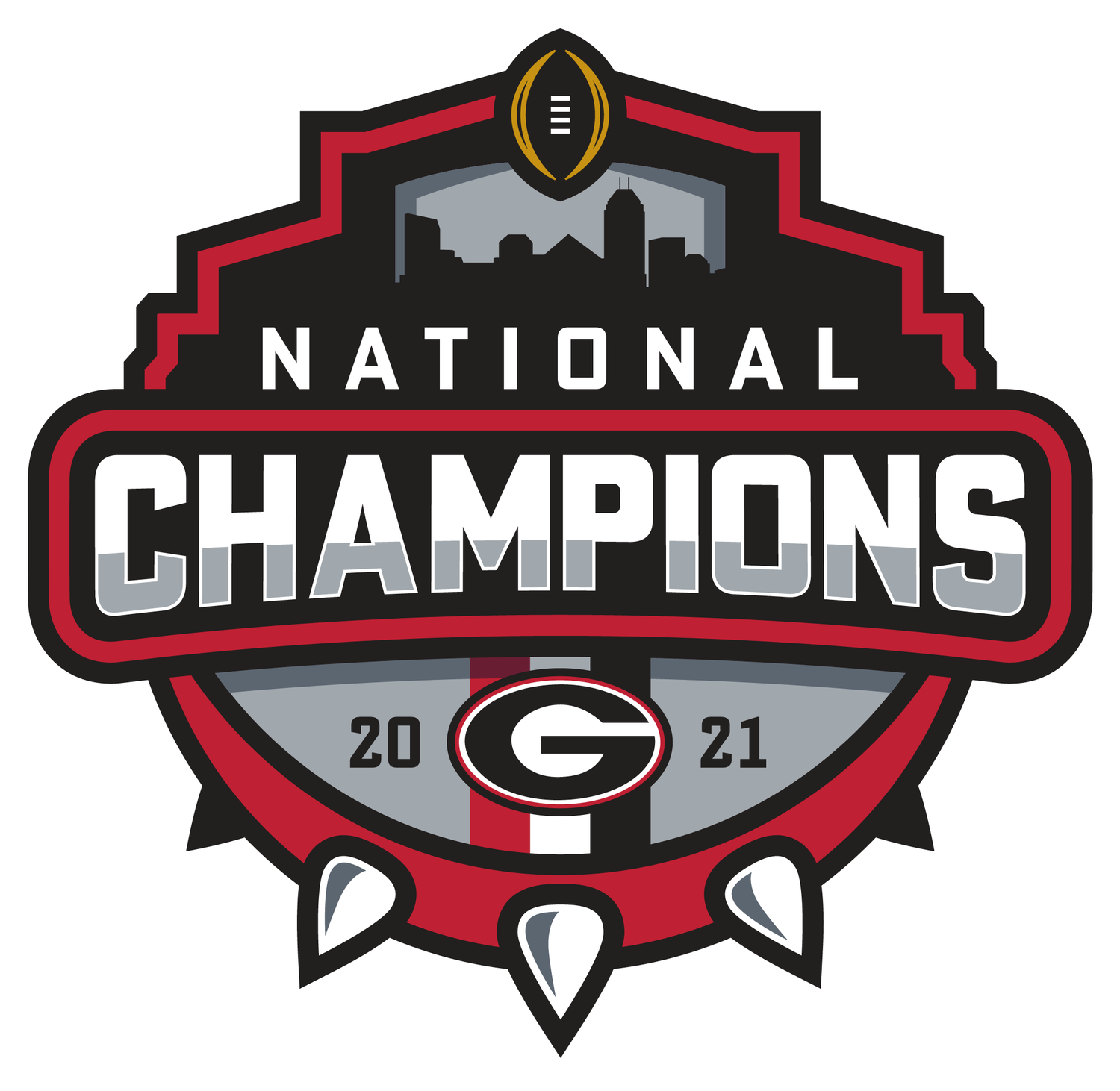
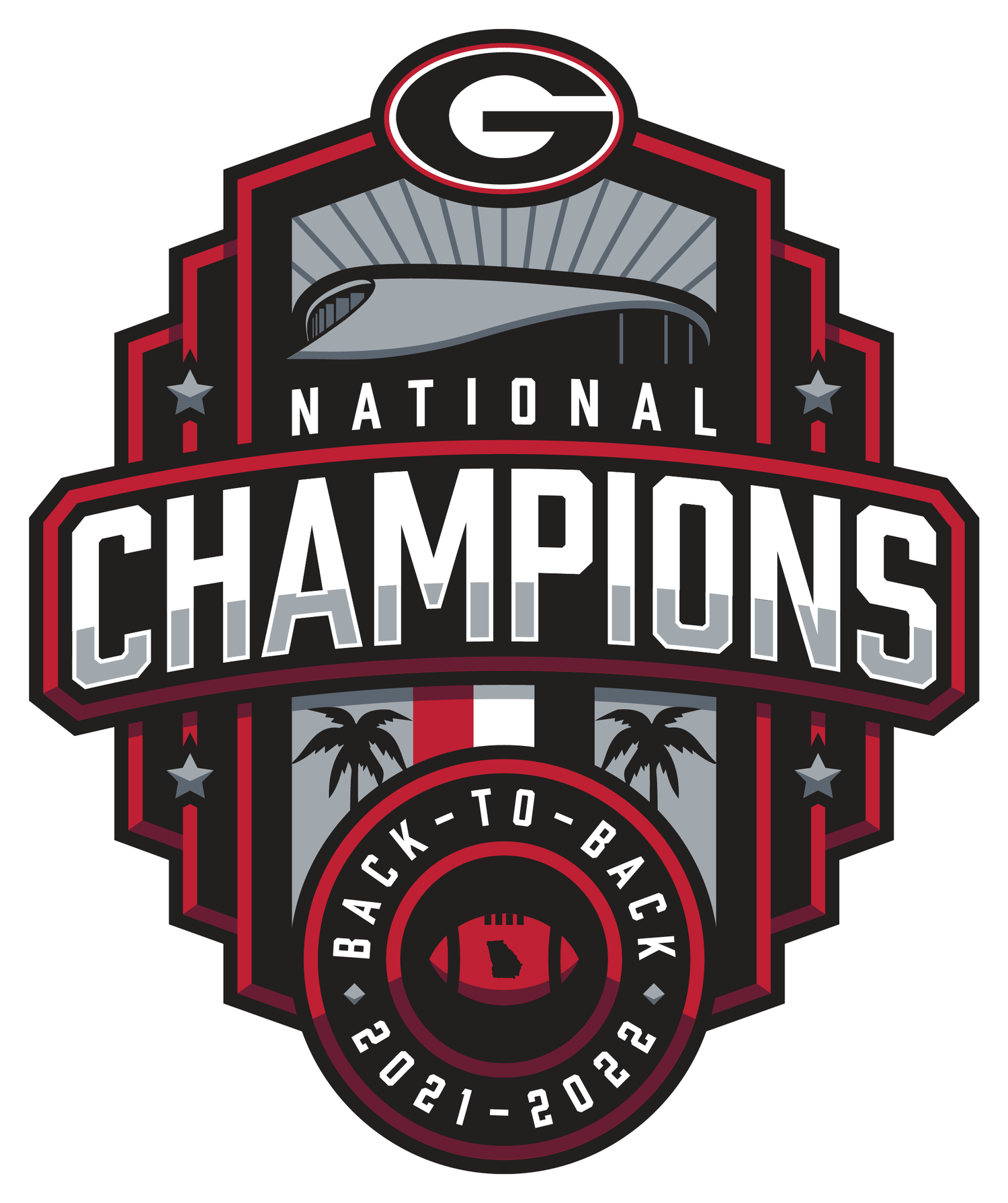
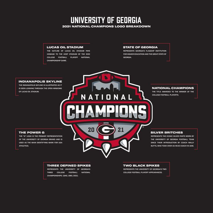
This collection celebrates Georgia Football’s national championships through a series of custom-designed commemorative logos. Each mark tells the story of its respective championship, incorporating historical references, architectural elements, program traditions, and symbolic details that connect the design to the moment it represents.
Develop a collection of championship identities that honor Georgia’s football history while giving each title its own visual character. The objective was to create designs that went beyond traditional championship branding, using meaningful details to capture the significance of each season, its location, and its place in the program’s legacy.
Every element serves a purpose. From the Rose Bowl imagery of 1942 and New Orleans architecture of 1980 to the host-city landmarks and program milestones of 2021 and 2022, each logo incorporates carefully selected details that connect Georgia’s history to its championship moments.
The accompanying breakdowns reveal the thinking behind each design, demonstrating how research, symbolism, and visual storytelling come together to create four distinct marks connected by one program’s history.
Rose Bowl, Pasadena · 1943
Sugar Bowl, New Orleans · 1981
CFP National Championship, Indianapolis · 2022
CFP National Championship, Los Angeles · 2023
Case study · Content design · 2023
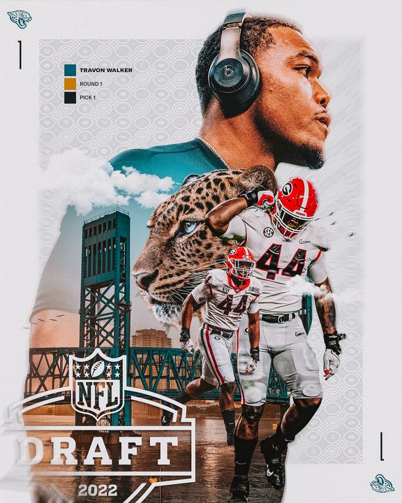
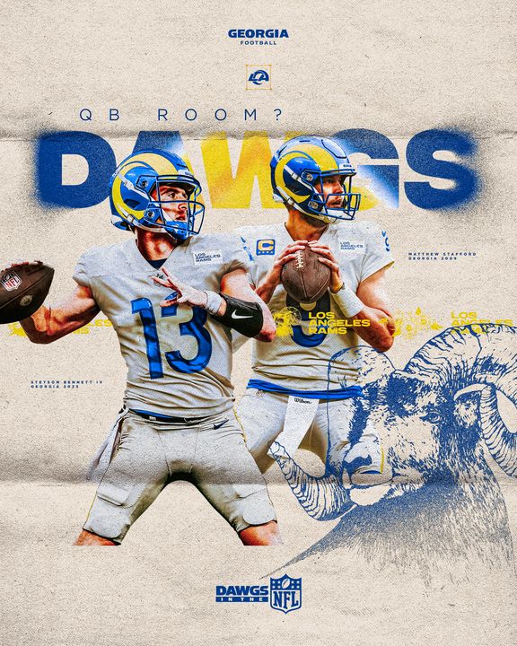
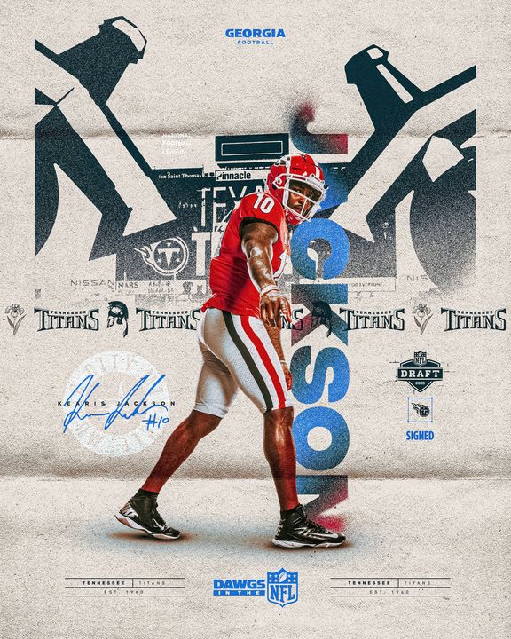
Dawgs in the NFL is Georgia Football’s draft content series. For the 2023 draft, one visual system carried every graphic across draft week: a paper-and-print texture, team-color palettes pulled from each franchise, and a consistent set of Georgia and NFL marks. It covered the class-wide announcement, individual picks, team and division features, position-group milestones and Instagram stories on all three days of the draft in Kansas City.
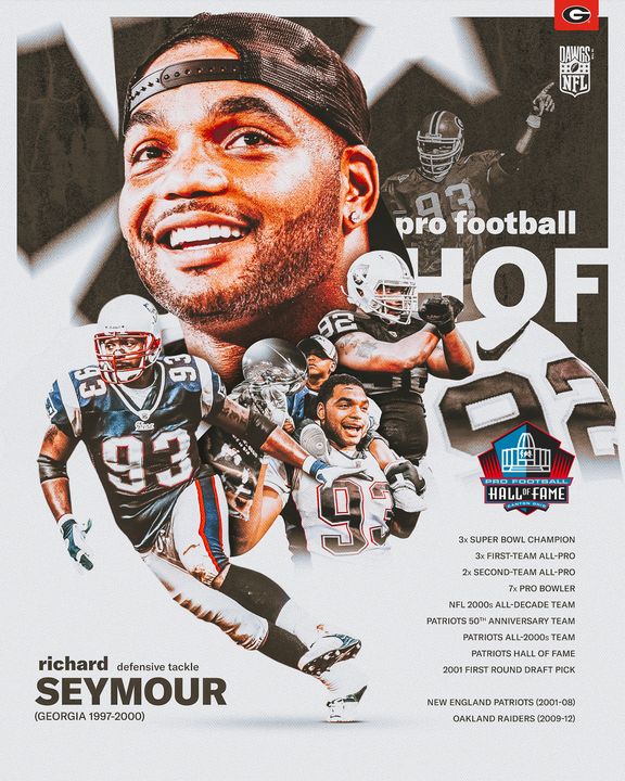
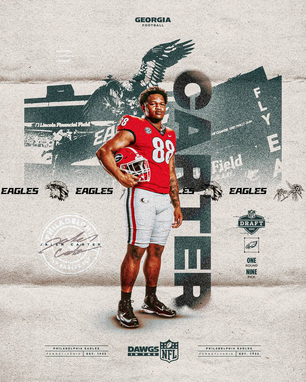
Each pick got its own graphic: a stadium stamp from the drafting team’s home field, an oversized last name, team wordmarks and illustrations, and the draft round and pick.
Each pick graphic is built from the same layers: the player, a stamped stadium from the team’s home field, an oversized last name, a team banner with wordmark, mascot and state flower illustrations, a team seal with signature, the draft round and pick, and a Dawgs in the NFL lower third. Hover or tap a layer below to see where it sits on the Jalen Carter graphic.
The same system was adapted for vertical Instagram stories on each day of the draft.
Georgia players drafted into each NFL division over the years were grouped under the conference and division marks, with the year, round and pick for each.
All 32 teams, one graphic each, featuring a former Bulldog and the franchise’s history with Georgia players. Each team’s palette, stadium, mascot and state flower change the look while the layout stays recognizable.
Graphics for the week itself: the class-wide announcement, the on-the-clock and rookie numbers graphics, contract and signing moments, the Orange Bowl connection to each drafted Bulldog, and position-group milestones.
Case study · Sports identity · 2022
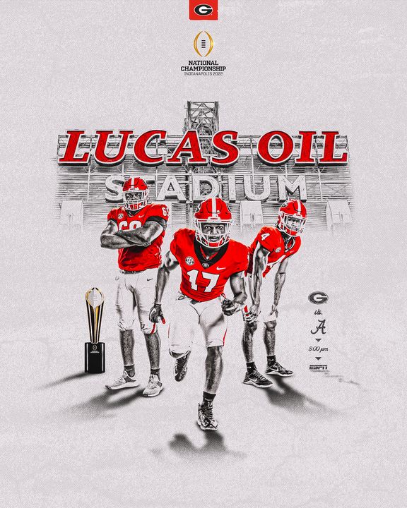
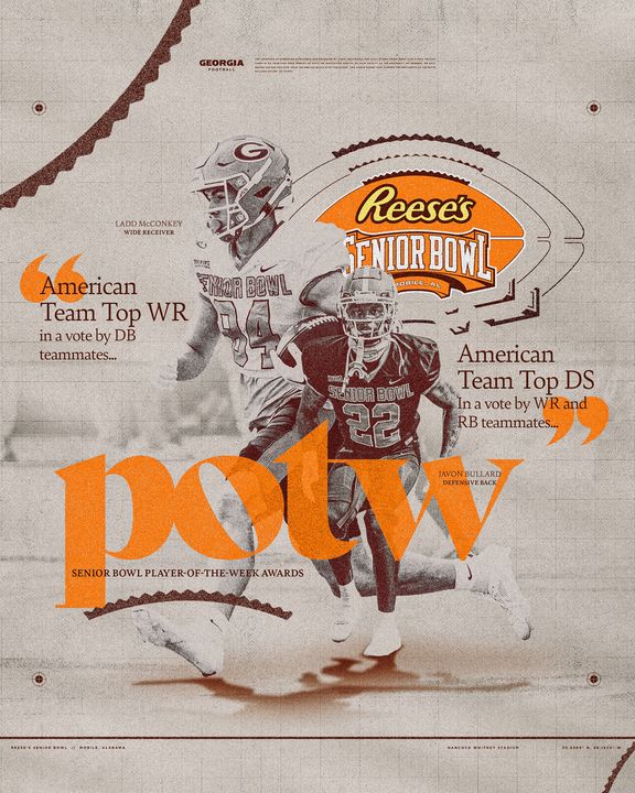
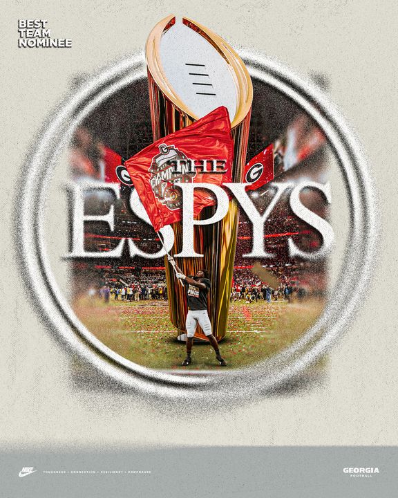
Georgia Football’s 2022 postseason presented an opportunity to build a distinct visual identity around the program’s pursuit of a second consecutive national championship. Spanning the SEC Championship, Chick-fil-A Peach Bowl, and College Football Playoff National Championship, this collection showcases a cohesive creative approach developed to capture the significance, intensity, and accomplishments of Georgia’s historic postseason run.
Develop a unified postseason identity that could carry across three championship stages while giving each event its own visual character. The creative needed to support a wide range of content, including game day graphics, player features, individual milestones, award recognition, and championship celebrations, all while maintaining consistency across the postseason.
The visual direction combined Georgia’s signature red and black with textured neutral backgrounds, bold typography, layered photography, and architectural references to create a distinctive postseason aesthetic. Event-specific branding and championship details were incorporated throughout, allowing each stage of the postseason to establish its own identity while remaining connected to the larger creative system.
From Georgia’s SEC Championship victory to its dramatic Peach Bowl win and eventual national title, the collection demonstrates how a consistent visual language can evolve alongside a team’s accomplishments, capturing individual performances and historic moments within one cohesive body of work.
Dec. 3, 2022 · Georgia 50, LSU 30
College Football Playoff Semifinal · Dec. 31, 2022 · Georgia 42, Ohio State 41
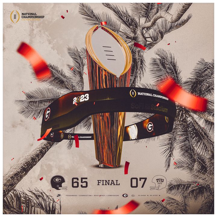
College Football Playoff National Championship · Jan. 9, 2023 · Georgia 65, TCU 7
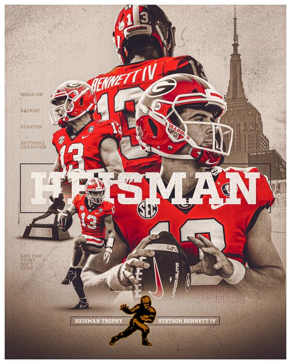
Stetson Bennett IV · Heisman Trophy finalist
Case study · Video & original content
Case study · Sports identity · 2023–24
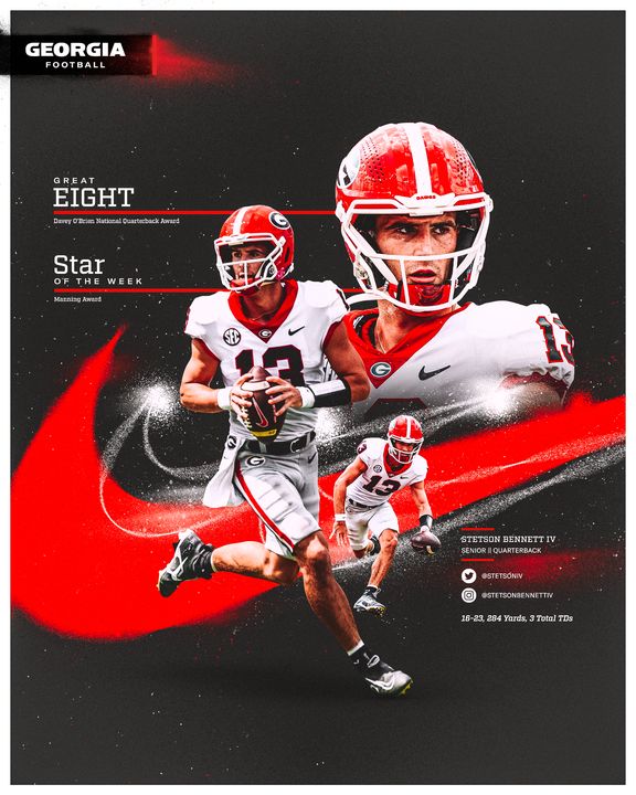
Following back-to-back national championships, Georgia Football entered the 2023 season with heightened expectations and a standard of excellence to uphold. This collection showcases the visual identity and creative content developed throughout the season, capturing the program’s players, milestones, traditions, and defining moments through a cohesive approach to sports design.
Develop a consistent and recognizable visual identity for the 2023 Georgia Football season that could adapt to the demands of a year-round content schedule. From player features and weekly matchups to record-breaking performances, national rankings, and postseason coverage, the objective was to create compelling visuals that reflected the program’s championship standard while keeping the creative approach fresh and engaging.
The creative direction centered on bold typography, detailed compositions, historical imagery, and Georgia’s iconic red, black, and silver color palette. Each design balanced contemporary sports graphics with elements of the program’s history and tradition, creating a visual connection between Georgia’s past and present.
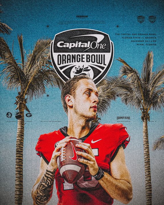
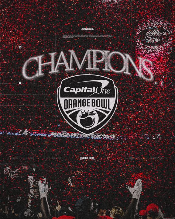
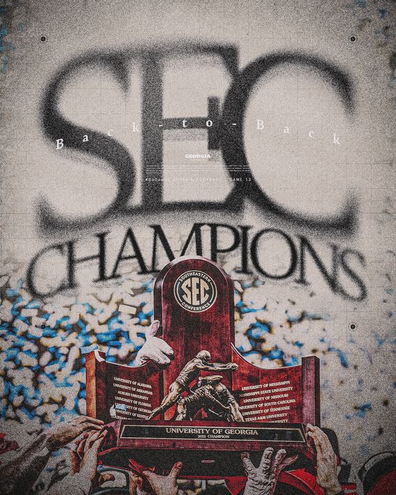
The collection demonstrates the range and flexibility of the season’s creative identity, from individual player storytelling and milestone recognition to large-scale moments surrounding the SEC Championship and Capital One Orange Bowl.
13 games · Players of the week
College Football Playoff and New Year’s Six bowls
Dec. 30, 2023 · Hard Rock Stadium, Miami · Georgia 63, Florida State 3
Game 13 · Alabama · Dec. 2, 2023 · Mercedes-Benz Stadium
Game week and game day graphics · Games 1–12
Matchup, kickoff time and broadcast · Games 5–13
Season stats and milestones
New hires
Preseason, midseason, final and academic teams
First, second and freshman teams
Weekly honors · 11 graphics
Finalists and winners
SEC Media Day · July 18